Showing posts with label infographics. Show all posts

Friday, 17 October 2014

Your Life on Earth - cool interactive from the BBC

Your life on earth


Enter your details and this cool interactive will show you some of the things that have happened in your life time.

Enjoy!

BBC Earth Story Right Here

and while I am here this is pretty cool too:
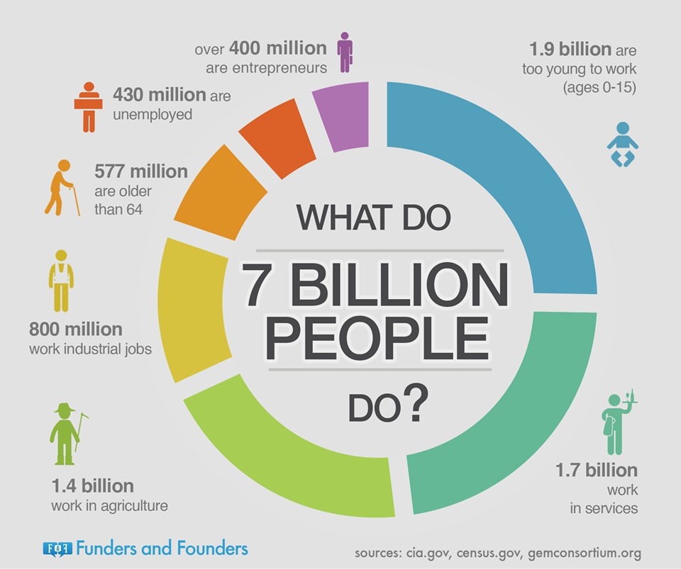
World Population and Me

Sunday, 20 April 2014

The Depth of the Problem of MH370

http://apps.washingtonpost.com/g/page/world/the-depth-of-the-problem/931/

Click on the link, this article has a wonderful infographic about just how difficult it is to try and find the black box (Australian invention) of MH370.


They say time is running out, but what about how long it took them to find the Titanic or the Air France aeroplane? They will keep on looking, but will they find this one?

Which governments do you think should continue to look for the wreckage of MH370 and why?

Units of Measurement:

feet and metres 
from google.com


PSI - pounds per square inch
Source - http://en.wikipedia.org/wiki/Pounds_per_square_inch


A figure showing pressure exerted by particle collisions inside a closed container. The collisions that exert the pressure are highlighted in red.


pings
http://science.howstuffworks.com/transport/flight/modern/black-box8.htm
How Stuff Works is a great site.

Thursday, 27 March 2014

We Are Happy - AS A TOKEN OF GRATITUDE TO PHARRELL WILLIAMS

This came across my social media world today:

"AS A TOKEN OF GRATITUDE TO PHARRELL WILLIAMS, WE ARE FROM L.A. - CLÉMENT DUROU & PIERRE DUPAQUIER, FOR THEIR WORLDWIDE CONTAGIOUS HAPPINESS..."


We Are Happy Map of Videos - a map is a graph - enjoy!

Here's the one we looked at

Wednesday, 30 October 2013

Zombies and Relationships - will they last?

In MYP5 we are looking at the mathematical modelling of a Zombie Apocalypse and my sister, Michelle Griffin, posted this in facebook today

Charting 20 Years of Pop-Culture Witches, Zombies, and Vampires from Vulture (a very good read indeed)


And she also posted this very cool statistical study on relationships and predicting their outcomes (stay together or ...).

"It’s not in the stars after all. Instead, it seems, the shape of a person’s social network is a powerful signal that can identify one’s spouse or romantic partner — and even if a relationship is likely to break up"

Here is the fascinating article about it from the New York Times

A graphical representation of one person's network neighborhood on Facebook.
Cameron Marlow/FacebookA graphical representation of one person’s network neighborhood on Facebook.

Thursday, 15 August 2013

Who are you (mathematically speaking)?

Your task is to create an infographic about yourself. Before you get started take a look at some examples and ask yourself:
What do I know?
What do I want to know?

Below you will find three examples of infographics created by students. 

Following the student examples are some infographics from the 

In ManageBac is your task and some more links for you to explore.


Student Infographic #1 - what do you know about this person now?

Student Infographic #3 - what do you know about this person now?

Student Infographic #3 - what do you know about this person now?
http://up.wallwisher.net/20130813/4284c23c4da6a983c578fa4391dd1f62.jpeg


http://www.joelertola.com/grfx/index.html
When Sea Levels Attack - from Information is Beautiful


http://sandiegosurfingschool.com/wp-content/uploads/2013/05/biggest-waves-1024x576.jpg


http://24.media.tumblr.com/884e2abac0ec848fa6491bf7227ba642/tumblr_mn4gj6Yzeu1s6bw99o1_1280.jpg